If you’ve been scrolling through Pinterest lately and feel like you’re drowning in an endless sea of blush pink, sage green, and terracotta, we need to talk. Don’t get me wrong, those palettes are beautiful. But if you’re looking for something that feels a little fresher, a little lighter, and like a literal breath of coastal air, I have the answer.
Enter the chat: Butter Yellow and Light Blue.
It’s giving “chic garden party in the South of France.” It’s giving “Nancy Meyers movie set.” It’s bright, it’s ridiculously happy, and most importantly, it doesn’t look like you tried too hard. If you are currently deep in the trenches of building out your wedding mood board for a spring or summer event, this color combination is absolute gold. It balances warmth and cool tones perfectly, feeling timeless and completely fresh all at once.
Here is your deep dive into how to pull off this gorgeous butter yellow and light blue wedding palette without making your venue look like an Easter basket explosion.
The Vibe Check: Why This Palette Works
The secret to making this work—and making it look expensive—is the shade of the colors. Precision is key here.
We aren’t talking about neon sunshine yellow or deep, nautical navy. We are talking about the creamy, rich color of actual French butter (or inside of a chamomile daisy) paired with the soft, dusty blue of a clear morning sky or a washed-out hydrangea.
Light blue acts as your calming, sophisticated “new neutral,” while the butter yellow brings in the energy, the warmth, and that touch of whimsy that makes people smile when they walk into the reception. It’s sophisticated but doesn’t take itself too seriously.
The Supporting Cast: Accents & Textures
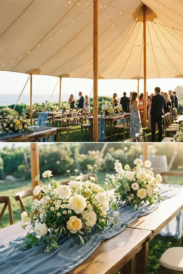
A color palette isn’t just two colors; it’s about what you pair them with to make them sing. To keep butter yellow and light blue grounded, you need great neutrals and textures.
- Crisp Whites & Creams: You need a lot of white space to let these colors breathe. Think crisp white table linens, cream-colored stationery paper, and white ceramic plates.
- Natural Textures: This is crucial. To avoid the “baby shower” look, introduce sophisticated textures. Think rattan chargers, natural wood chairs (like vineyard or wishbone chairs), and woven baskets.
- Metallics: A touch of brushed gold or brass looks incredible against dusty blue. It adds a little warmth and vintage glamour to the table settings.
The Fashion Breakdown
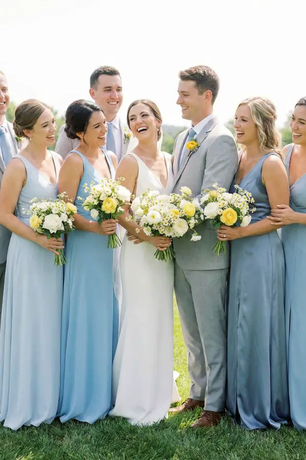
Dressing your VIPs in this palette is surprisingly easy because light blue is practically universally flattering on every skin tone.
The Wedding Party Put your favorite girls in soft, powder blue or dusty blue dresses. If you want the “mismatched” look that’s so popular right now, let them choose different fabrics—some in satin, some in chiffon, maybe one in a subtle blue floral print that has tiny yellow centers in the flowers.
For the guys, a classic light grey or a soft navy suit is the perfect anchor. You tie the look together with light blue ties or pocket squares. The yellow comes in with the boutonnière—think a single yellow ranunculus, a craspedia (billy button), or a tiny cluster of chamomile.
For You (The Couple) If you’re wearing white or ivory, consider a “something blue” that’s actually visible. Maybe pale blue heels, a blue ribbon tied around your bouquet, or aquamarine jewelry. For a more daring look, a pale yellow sash or hair ribbon is stunning for a garden wedding.
Florals, Lemons, and Tablescapes
This is where this palette truly shines, and where you can have the most fun without necessarily blowing your entire budget.
The Flowers You want flowers that feel organic and garden-picked, not stiff and overly arranged.
- For the Blue: Ask your florist for light blue delphinium (for height), fluffy pale blue hydrangeas, delicate tweedia, or nigella (love-in-a-mist).
- For the Yellow & Cream: Creamy yellow garden roses are a must. Add in cheerful poppies, sweet peas, ranunculus, and chamomile daisies for texture.
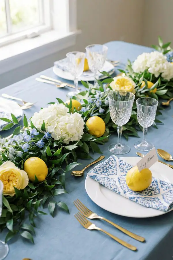
The Tablescape Secret Weapon: Lemons If you haven’t seen the “lemons as decor” trend yet, welcome to your new obsession. Fresh lemons are the perfect shade of yellow, they smell amazing, and they are significantly cheaper than flowers.
Scatter whole lemons and some with leaves still attached down the center of long tables amidst greenery runners. Fill ceramic bowls with them on round tables. It adds a gorgeous, organic pop of color that feels incredibly high-end and European.
The Linens & China Start with a base of dusty blue. A soft blue tablecloth sets a calming foundation. If you love pattern, this palette screams for “Chinoiserie chic.” A blue-and-white patterned runner, vase, or charger plate looks incredible against pops of yellow flowers.
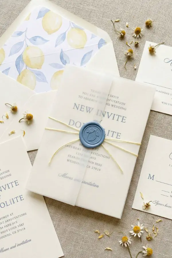
The Paper Trail & Signage
Your save-the-dates and invitations are the first glimpse your guests get of your wedding vibe, so set the tone early.
Think crisp white or soft cream cardstock as your base. Incorporate the colors through elegant details: a dusty blue letterpress font, a watercolor envelope liner featuring lemon branches, or a silk ribbon tie in pale yellow.
For day-of signage, a welcome sign painted in a soft blue with white lettering feels very coastal. Seating charts look beautiful with blue watercolor borders and yellow wax seals holding up the individual cards.
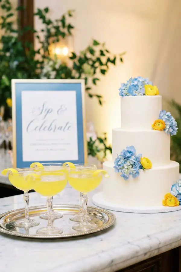
Food, Drink, and Sweet Treats
Why stop at the decor? Let your menu get in on the color action. It’s another layer of the experience for your guests.
The Signature Sips You absolutely, 100% need a Limoncello Spritz as your signature cocktail. It’s bright yellow, tastes like sunshine, and looks gorgeous in a coupe glass with a lemon twist. For a secondary drink to bring in the blue, consider a blueberry gin smash or a cocktail featuring blue curaçao (just ensure it’s mixed to be a soft blue, not electric Kool-Aid blue!).
The Cake Keep it elegant and simple. A clean white buttercream cake provides the perfect blank canvas. Decorate it with cascading fresh blue tweedia and yellow spray roses, or—you guessed it—some thin slices of candied lemons or dehydrated citrus wheels pressed into the side.
The Final Takeaway
The best part about a butter yellow and light blue wedding theme is the inherent joy it brings. It’s not overly moody, dark, or serious; it’s a celebration palette designed for sunshine and good times.
Keep your foundation neutral, use natural textures to keep it grounded, and let the blue and yellow act as the elegant pops of personality. Trust me, when the photos come back, you are going to be obsessed with how timeless and happy everyone looks.